building a SITE FROM SCRATCH
THE VIBE (HOW I APPROACHED IT):
I looked at competitor sites to see what wasn’t working (and what felt very forgettable), then designed something that pops, catches attention, and still stays true to the brand. Fun, intentional, and never off-brand.
THE CHALLENGE (BECAUSE I LIKE ONE):
Built in two months, start to finish.
I researched competitors, collected insights, mapped out structure, and picked up new skills along the way. It pushed me creatively—and I’m better for it.
WHAT I CARED ABOUT:
Brand-forward layouts
Scroll-friendly flow
Thoughtful spacing (yes, I care)
Clear hierarchy
Desktop + mobile polish
A FEW HIGHLIGHTS (SCREENSHOTS, BUT CURATED):
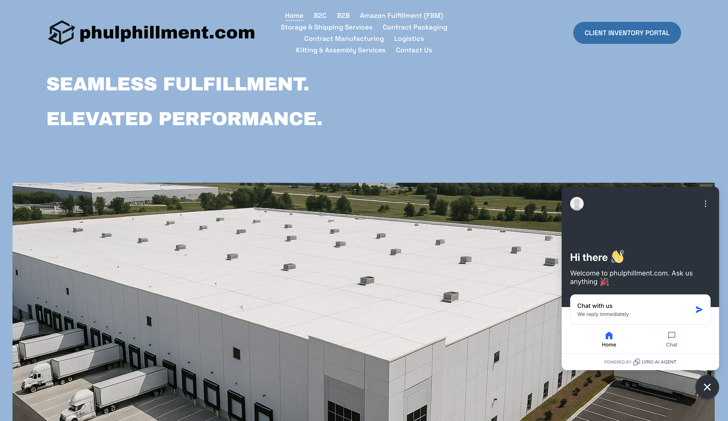
Brand Identity & First Impression
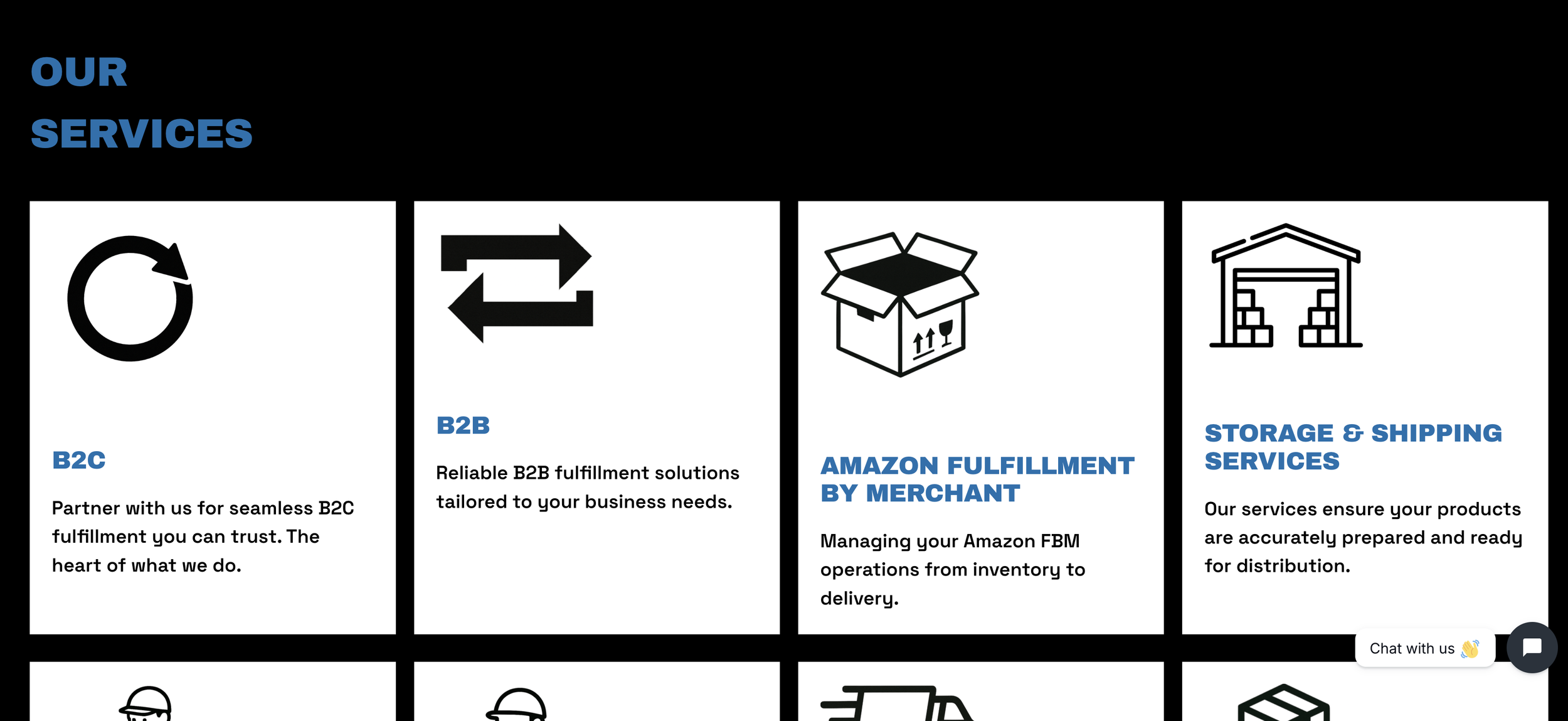
Services Layout & Visual Hierarchy
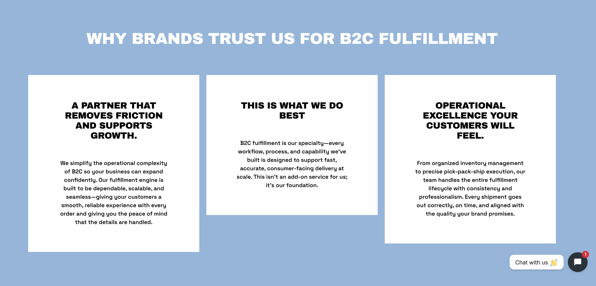
Trust-Building Content Section
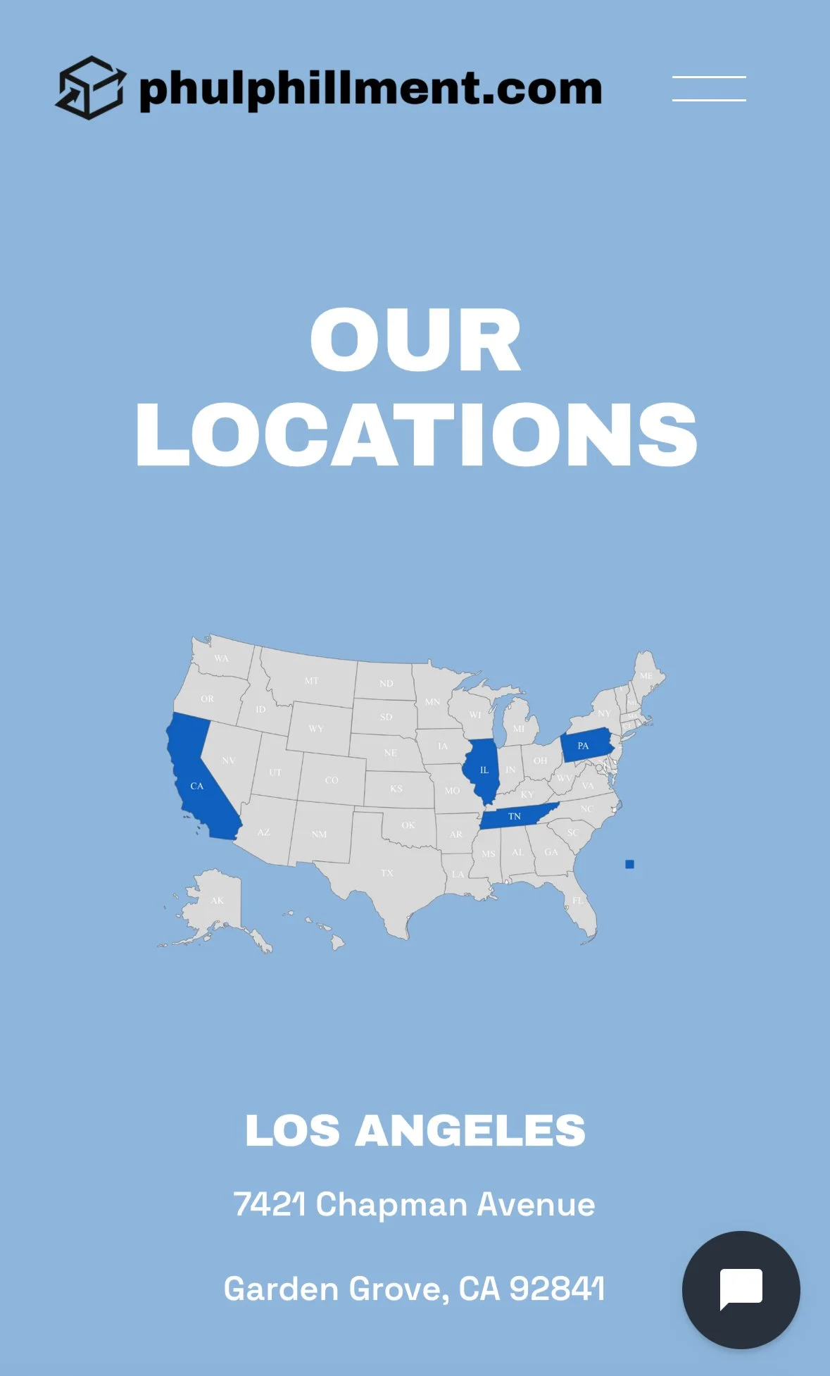
Mobile View
Mobile Homepage Experience
Location & Accessibility View